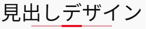
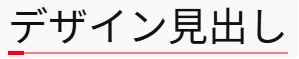
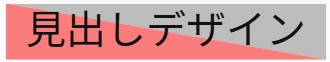
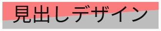
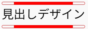
WordPressの見出しをスタイリッシュなデザインに装飾!

WordPressで見出しや段落に装飾を加えたいと思ったことはありませんか?
以下の記事では、ノーコードで見出しや段落に装飾を加える方法を紹介しています。
もちろん、ノーコードでもある程度の見映えは工夫できますが、やはり表現の幅には限界があります。
こんな方におすすめ!
・CSSのコピペくらいならできるのでもっとスタイリッシュなデザインにしたい!
・AIに聞いてみたけど何かちょっと違う
・他では見ないユニークな装飾を試してみたい
この記事では、コピペで使えるCSSコードを紹介します。
WordPressの見出しブロックにクラスを付けて、CSSを貼り付けるだけでOKです。
「CSSコード集はたくさんあるけど、どれも似たようなものばかり…」という方のために、他にはあまりない装飾デザインを集めました!
では、さっそく行ってみましょう。
CSSコードの使い方
CSSコードは次のような形式になっています。
.クラス名 {
    設定;
}
■ クラス名は自分で好きなものに変更できます
コピペする際に「クラス名」の部分を好きなものに変更し、変更したクラス名を追加CSSクラスに記入してください。
CSSコードを変更する際に、クラス名のところが「クラス名::before」「クラス名::after」となっているものがあります。
この場合も「クラス名」部分を変更するようにしてください。
例えば元のコードが以下のような場合:
.prefix-design1 {
    position: relative;
}
.prefix-design1::before {
    position: absolute;
}
クラス名を「abcde-heading1」にしたいときは、次のように書き換えます。
.abcde-heading1 {
    position: relative;
}
.abcde-heading1::before {
    position: absolute;
}
❌先頭のピリオドは消さないようにしてください。
面倒くさかったらクラス名を変更せずにそのまま張り付けて大丈夫です。
■すべての「h2」に反映させることもできます
クラス名の代わりにh2を使えば、すべてのh2タグに適用されます。
h3に反映させたい場合は「h3」に変更です。
先頭のピリオドは削除してください。
上の例だとこのようになります。
h2 {
    position: relative;
}
h2::before {
    position: absolute;
}
■クラスの付け方やCSSの編集方法が分からない方
デザインリスト
以下に、オリジナルの見出し装飾デザインを一覧で紹介します。
※すべてコピペOK!気に入ったものをぜひ使ってください。
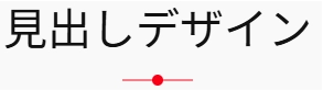
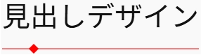
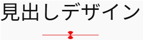
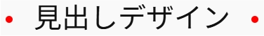
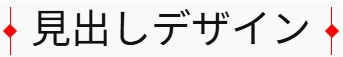
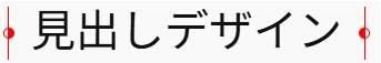
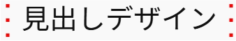
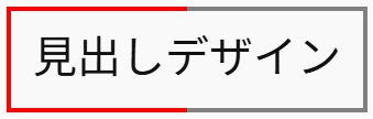
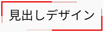
スタイリッシュなアンダーライン-1
詳細を表示
background-color:red;となっている行の「red」の部分を書き換えれば他の色にできます。
横の位置がずれる場合は、見出しブロックをグループ化してください。(方法はこちら)
.tantive-heading-stylish1 {
position: relative;
width: inline-block;
}
.tantive-heading-stylish1::before,
.tantive-heading-stylish1::after {
content: "";
position: absolute;
bottom: 0;
left: 50%;
background-color: red;
transform: translate(-50%, 50%);
}
.tantive-heading-stylish1::before {
width: min(80%, 4rem);
height: 1px;
}
.tantive-heading-stylish1::after {
width: min(20%, 1rem);
height: 4px;
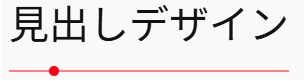
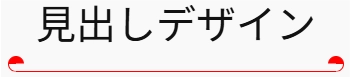
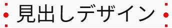
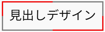
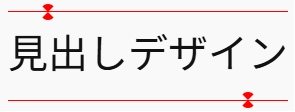
}スタイリッシュなアンダーライン-2
詳細を表示
background-color:red;となっている行の「red」の部分を書き換えれば他の色にできます。
横の位置がずれる場合は、見出しブロックをグループ化してください。(方法はこちら)
.tantive-heading-stylish2 {
position: relative;
display: inline-block;
}
.tantive-heading-stylish2::before,
.tantive-heading-stylish2::after {
content: "";
position: absolute;
bottom: 0;
left: 0;
background-color: red;
transform: translateY(50%);
}
.tantive-heading-stylish2::before {
width: 100%;
height: 1px;
}
.tantive-heading-stylish2::after {
width: min(20%, 1rem);
height: 4px;
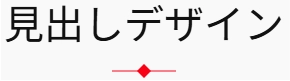
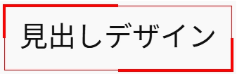
}スタイリッシュなアンダーライン-3
詳細を表示
background-color:red;となっている行の「red」の部分を書き換えれば他の色にできます。
横の位置がずれる場合は、見出しブロックをグループ化してください。(方法はこちら)
.tantive-heading-stylish3 {
position: relative;
display: inline-block;
padding-bottom: 0.5em;
}
.tantive-heading-stylish3::before,
.tantive-heading-stylish3::after {
content: "";
position: absolute;
bottom: 0;
left: 50%;
background-color: red;
transform: translate(-50%, 50%);
}
.tantive-heading-stylish3::before {
width: min(80%, 4rem);
height: 1px;
}
.tantive-heading-stylish3::after {
width: 10px;
height: 10px;
border-radius: 50%;
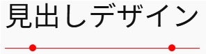
}スタイリッシュなアンダーライン-4
詳細を表示
background-color:red;となっている行の「red」の部分を書き換えれば他の色にできます。
横の位置がずれる場合は、見出しブロックをグループ化してください。(方法はこちら)
.tantive-heading-stylish4 {
    position: relative;
    display: inline-block;
    padding-bottom: 0.5em;
}

.tantive-heading-stylish4::before,
.tantive-heading-stylish4::after {
    content: "";
    position: absolute;
    bottom: 0;
    background-color: red;
    transform: translateY(50%);
}

.tantive-heading-stylish4::before {
    width: 100%;
    height: 1px;
    left: 0;
}

.tantive-heading-stylish4::after {
    width: 10px;
    height: 10px;
    border-radius: 50%;
    left: 1em;
}
スタイリッシュなアンダーライン-5
詳細を表示
background-color:red;となっている行の「red」の部分を書き換えれば他の色にできます。
横の位置がずれる場合は、見出しブロックをグループ化してください。(方法はこちら)
.tantive-heading-stylish5 {
    position: relative;
    display: inline-block;
    padding-bottom: 0.5em;
}

.tantive-heading-stylish5::before,
.tantive-heading-stylish5::after {
    content: "";
    position: absolute;
    bottom: 0;
    left: 50%;
    background-color: red;
}

.tantive-heading-stylish5::before {
    width: min(80%, 4rem);
    height: 1px;
    transform: translate(-50%, 50%);
}

.tantive-heading-stylish5::after {
    width: 10px;
    height: 10px;
    transform: translate(-50%, 50%) rotate(45deg);
}
スタイリッシュなアンダーライン-6
詳細を表示
background-color:red;となっている行の「red」の部分を書き換えれば他の色にできます。
横の位置がずれる場合は、見出しブロックをグループ化してください。(方法はこちら)
.tantive-heading-stylish6 {
width: fit-content;
position: relative;
padding-bottom: 0.5em;
}
.tantive-heading-stylish6::before,
.tantive-heading-stylish6::after {
content: "";
position: absolute;
bottom: 0;
background-color: red;
}
.tantive-heading-stylish6::before{
width: 100%;
height: 1px;
left: 0;
transform: translateY(50%);
}
.tantive-heading-stylish6::after {
width: 10px;
height: 10px;
left: 1em;
transform: translateY(50%) rotate(45deg)
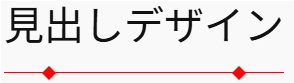
}スタイリッシュなアンダーライン-7
詳細を表示
border-bottom: 1px solid red;となっている行とbackground-color:red;となっている行の「red」の部分を書き換えれば他の色にできます。
横の位置がずれる場合は、見出しブロックをグループ化してください。(方法はこちら)
.tantive-heading-stylish10 {
	width: fit-content;
	position: relative;
	padding-left: 0;
	padding-right: 0;
	padding-bottom: 0.5em;
	border-bottom: 1px solid red;
}

.tantive-heading-stylish10::before,
.tantive-heading-stylish10::after {
	content: "";
	position: absolute;
	width: 10px;
	height: 10px;
	bottom: 0;
	background-color: red;
	border-radius: 50%;
}

.tantive-heading-stylish10::before {
	left: 1em;
	transform: translate(-50%, 50%);
}

.tantive-heading-stylish10::after {
	right: 1em;
	transform: translate(50%, 50%);
}
スタイリッシュなアンダーライン-8
詳細を表示
border-bottom: 1px solid red;となっている行とbackground-color:red;となっている行の「red」の部分を書き換えれば他の色にできます。
横の位置がずれる場合は、見出しブロックをグループ化してください。(方法はこちら)
.tantive-heading-stylish11 {
	width: fit-content;
	position: relative;
	padding-left: 0;
	padding-right: 0;
	padding-bottom: 0.5em;
	border-bottom: 1px solid red;
}

.tantive-heading-stylish11::before,
.tantive-heading-stylish11::after {
	content: "";
	position: absolute;
	width: 10px;
	height: 10px;
	bottom: -1px;
	background-color: red;
	transform: translateY(50%) rotate(45deg);
}

.tantive-heading-stylish11::before {
	left: 1em;
}

.tantive-heading-stylish11::after {
	right: 1em;
}
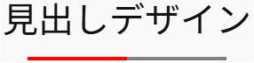
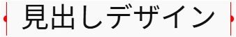
スタイリッシュなアンダーライン-9
詳細を表示
background: linear-gradient(to right, red 0%, red 50%, gray 50%, gray 100%);となっている行の「red」と「gray」の部分を書き換えれば他の色にできます。
横の位置がずれる場合は、見出しブロックをグループ化してください。(方法はこちら)
.tantive-heading-stylish16 {
	width: fit-content;
	position: relative;
	padding-bottom: 0.5em;
}

.tantive-heading-stylish16::before {
	content: "";
	position: absolute;
	width: 80%;
	height: 4px;
	left: 50%;
	bottom: 0;
	transform: translateX(-50%);
	background: linear-gradient(to right, red 0%, red 50%, gray 50%, gray 100%);
}
スタイリッシュなアンダーライン-10
詳細を表示
background-color: red;となっている行の「red」と「gray」の部分を書き換えれば他の色にできます。
横の位置がずれる場合は、見出しブロックをグループ化してください。(方法はこちら)
.tantive-heading-stylish31 {
	width: fit-content;
	position: relative;
	padding-bottom: 0.5em;
}

.tantive-heading-stylish31::before,
.tantive-heading-stylish31::after {
	content: "";
	position: absolute;
	bottom: 0;
	left: 50%;
	background-color: red;
}

.tantive-heading-stylish31::before {
	width: 1rem;
	height: 1rem;
	border-radius: 50%;
	clip-path: polygon(0 0, 50% 0, 50% 100%, 100% 100%, 100% 50%, 0 50%);
	transform: translate(-50%, 50%) rotate(45deg);
}

.tantive-heading-stylish31::after {
	width: min(4em, 40%);
	height: 1px;
	transform: translate(-50%, 50%);
}
スタイリッシュなアンダーライン-11
詳細を表示
border-bottom: 1px solid red;
background: linear-gradient(to bottom, red 0, red 50%, transparent 50%, transparent 100%);
border: 1px solid red;
となっている3行の「red」の部分を書き換えれば他の色にできます。
横の位置がずれる場合は、見出しブロックをグループ化してください。(方法はこちら)
.tantive-heading-stylish33 {
	position: relative;
	width: fit-content;
	padding-right: 0.5em;
	padding-bottom: 0.5em;
	padding-left: 0.5em;
	border-bottom: 1px solid red;
}

.tantive-heading-stylish33::before,
.tantive-heading-stylish33::after {
	content: "";
	position: absolute;
	width: 1rem;
	height: 1rem;
	bottom: 0;
	background: linear-gradient(to bottom, red 0, red 50%, transparent 50%, transparent 100%);
	border-radius: 50%;
	border: 1px solid red;
	box-sizing: border-box;
}

.tantive-heading-stylish33::before {
	left: 0;
	clip-path: polygon(0 0, 100% 0, 100% 50%, 50% 50%, 50% 100%, 0 100%);
	transform: translate(-50%, 1px);
}

.tantive-heading-stylish33::after {
	right: 0;
	clip-path: polygon(0 0, 100% 0, 100% 100%, 50% 100%, 50% 50%,0 50%);
	transform: translate(50%, 1px);
}
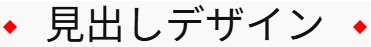
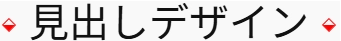
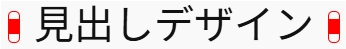
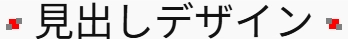
スタイリッシュなアイコン風ー1
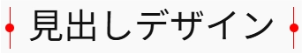
詳細を表示
order-right: 1px solid red、border-left: 1px solid red;、;background-color:red;となっている3行の「red」の部分を書き換えれば他の色にできます。
横の位置がずれる場合は、見出しブロックをグループ化してください。(方法はこちら)
.tantive-heading-stylish12 {
width: fit-content;
position: relative;
padding-left: 0.5em;
padding-right: 0.5em;
border-right: 1px solid red;
border-left: 1px solid red;
}
.tantive-heading-stylish12::before,
.tantive-heading-stylish12::after {
content: "";
position: absolute;
width: 10px;
height: 10px;
top: 50%;
background-color: red;
border-radius: 50%;
}
.tantive-heading-stylish12::before {
left: 0;
transform: translate(calc(-50% - 1px), -50%);
}
.tantive-heading-stylish12::after {
right: 0;
transform: translate(calc(50% + 1px), -50%);
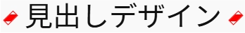
}スタイリッシュなアイコン風ー2
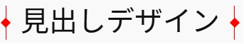
詳細を表示
border-right: 1px solid red;、border-left: 1px solid red;、background-color:red;となっている3行の「red」の部分を書き換えれば他の色にできます。
横の位置がずれる場合は、見出しブロックをグループ化してください。(方法はこちら)
.tantive-heading-stylish13 {
	width: fit-content;
	position: relative;
	padding-left: 0.5em;
	padding-right: 0.5em;
	border-right: 1px solid red;
	border-left: 1px solid red;
}

.tantive-heading-stylish13::before,
.tantive-heading-stylish13::after {
	content: "";
	position: absolute;
	width: 10px;
	height: 10px;
	top: 50%;
	background-color: red;
}

.tantive-heading-stylish13::before {
	left: 0;
	transform: translate(calc(-50% - 1px), -50%) rotate(45deg);
}

.tantive-heading-stylish13::after {
	right: 0;
	transform: translate(calc(50% + 1px), -50%) rotate(45deg);
}
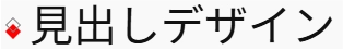
スタイリッシュなアイコン風ー3
詳細を表示
background-color:red;となっている行の「red」の部分を書き換えれば他の色にできます。
横の位置がずれる場合は、見出しブロックをグループ化してください。(方法はこちら)
.tantive-heading-stylish7 {
	width: fit-content;
	position: relative;
	padding-left: 1em;
	padding-right: 1em;
}

.tantive-heading-stylish7::before,
.tantive-heading-stylish7::after {
	content: "";
	position: absolute;
	top: 50%;
	width: 10px;
	height: 10px;
	border-radius: 50%;
	background-color: red;
	transform: translateY(-50%);
}

.tantive-heading-stylish7::before {
	left: 0;
}

.tantive-heading-stylish7::after {
	right: 0;
}
スタイリッシュなアイコン風ー4
詳細を表示
background-color:red;となっている行の「red」の部分を書き換えれば他の色にできます。
横の位置がずれる場合は、見出しブロックをグループ化してください。(方法はこちら)
.tantive-heading-stylish8 {
	width: fit-content;
	position: relative;
	padding-left: 1em;
	padding-right: 1em;
}

.tantive-heading-stylish8::before,
.tantive-heading-stylish8::after {
	content: "";
	position: absolute;
	top: 50%;
	width: 10px;
	height: 10px;
	background-color: red;
	transform: translateY(-50%) rotate(45deg);
}

.tantive-heading-stylish8::before {
	left: 0;
}

.tantive-heading-stylish8::after {
	right: 0;
}
スタイリッシュなアイコン風ー5
詳細を表示
background-color:red;となっている行の「red」の部分を書き換えれば他の色にできます。
横の位置がずれる場合は、見出しブロックをグループ化してください。(方法はこちら)
.tantive-heading-stylish9 {
	width: fit-content;
	position: relative;
}

.tantive-heading-stylish9::before,
.tantive-heading-stylish9::after {
	content: "";
	position: absolute;
	width: 10px;
	height: 10px;
	left: -0.5em;
	box-sizing: border-box;
}

.tantive-heading-stylish9::before {
	top: calc(50% + 3px);
	background-color: red;
	transform: translateY(-50%) rotate(45deg);
}

.tantive-heading-stylish9::after {
	top: calc(50% - 3px);
	border: 1px solid gray;
	transform: translateY(-50%) rotate(45deg);
}
スタイリッシュなアイコン風ー6
詳細を表示
border-right: 1px solid red;、border-left: 1px solid red;、background-color:red;となっている3行の「red」の部分を書き換えれば他の色にできます。
横の位置がずれる場合は、見出しブロックをグループ化してください。(方法はこちら)
.tantive-heading-stylish12 {
	width: fit-content;
	position: relative;
	padding-left: 0.5em;
	padding-right: 0.5em;
	border-right: 1px solid red;
	border-left: 1px solid red;
}

.tantive-heading-stylish12::before,
.tantive-heading-stylish12::after {
	content: "";
	position: absolute;
	width: 10px;
	height: 10px;
	top: 50%;
	background-color: red;
	border-radius: 50%;
}

.tantive-heading-stylish12::before {
	left: 0;
	transform: translate(calc(-50% - 1px), -50%);
}

.tantive-heading-stylish12::after {
	right: 0;
	transform: translate(calc(50% + 1px), -50%);
}
スタイリッシュなアイコン風ー7
詳細を表示
border-right: 1px solid red;、border-left: 1px solid red;、background-color:red;となっている3行の「red」の部分を書き換えれば他の色にできます。
横の位置がずれる場合は、見出しブロックをグループ化してください。(方法はこちら)
.tantive-heading-stylish13 {
	width: fit-content;
	position: relative;
	padding-left: 0.5em;
	padding-right: 0.5em;
	border-right: 1px solid red;
	border-left: 1px solid red;
}

.tantive-heading-stylish13::before,
.tantive-heading-stylish13::after {
	content: "";
	position: absolute;
	width: 10px;
	height: 10px;
	top: 50%;
	background-color: red;
}

.tantive-heading-stylish13::before {
	left: 0;
	transform: translate(calc(-50% - 1px), -50%) rotate(45deg);
}

.tantive-heading-stylish13::after {
	right: 0;
	transform: translate(calc(50% + 1px), -50%) rotate(45deg);
}
スタイリッシュなアイコン風ー8
詳細を表示
background: linear-gradient(225deg, transparent 0%, transparent 50%, red 50%, red 100%);、border: 1px solid red;となっている2行の「red」の部分を書き換えれば他の色にできます。
横の位置がずれる場合は、見出しブロックをグループ化してください。(方法はこちら)
.tantive-heading-stylish14 {
	width: fit-content;
	position: relative;
	padding-left: 0.5em;
}

.tantive-heading-stylish14::before {
	content: "";
	position: absolute;
	width: 10px;
	height: 10px;
	top: 50%;
	left: 0;
	background: linear-gradient(225deg, transparent 0%, transparent 50%, red 50%, red 100%);
	border: 1px solid red;
	box-sizing: border-box;
	transform: translate(-50%, -50%) rotate(-45deg);
}
スタイリッシュなアイコン風ー9
詳細を表示
border: 1px solid red;、background: linear-gradient(to bottom, transparent 0%, transparent 50%, red 50%, red 100%);となっている2行の「red」の部分を書き換えれば他の色にできます。
横の位置がずれる場合は、見出しブロックをグループ化してください。(方法はこちら)
.tantive-heading-stylish15 {
	width: fit-content;
	position: relative;
	padding-left: 0.5em;
}

.tantive-heading-stylish15::before {
	content: "";
	position: absolute;
	width: 10px;
	height: 10px;
	top: 50%;
	left: 0;
	border-radius: 50%;
	transform: translate(-50%, -50%);
	border: 1px solid red;
	border-radius: 50%;
	background: linear-gradient(to bottom,  transparent 0%, transparent 50%, red 50%, red 100%);
	box-sizing: border-box;
}
スタイリッシュなアイコン風ー10
詳細を表示
border-right: 1px solid red;、border-left: 1px solid red;、background-color: red;となっている3行の「red」の部分を書き換えれば他の色にできます。
横の位置がずれる場合は、見出しブロックをグループ化してください。(方法はこちら)
.tantive-heading-stylish29 {
	width: fit-content;
	position: relative;
	padding-left: 0.5em;
	padding-right: 0.5em;
	border-right: 1px solid red;
	border-left: 1px solid red;
}

.tantive-heading-stylish29::before,
.tantive-heading-stylish29::after {
	content: "";
	position: absolute;
	width: 10px;
	height: 10px;
	top: 50%;
	background-color: red;
	border-radius: 50%;
}

.tantive-heading-stylish29::before {
	left: 0;
	transform: translate(-50%, -50%);
	clip-path: polygon(0 0, 50% 0, 50% 100%, 0 100%);
}

.tantive-heading-stylish29::after {
	right: 0;
	transform: translate(50%, -50%);
	clip-path: polygon(50% 0, 100% 0, 100% 100%, 50% 100%);
}
スタイリッシュなアイコン風ー11
詳細を表示
border-right: 1px solid red;、border-left: 1px solid red;、background-color: red;となっている3行の「red」の部分を書き換えれば他の色にできます。
横の位置がずれる場合は、見出しブロックをグループ化してください。(方法はこちら)
.tantive-heading-stylish29 {
	width: fit-content;
	position: relative;
	padding-left: 0.5em;
	padding-right: 0.5em;
	border-right: 1px solid red;
	border-left: 1px solid red;
}

.tantive-heading-stylish29::before,
.tantive-heading-stylish29::after {
	content: "";
	position: absolute;
	width: 10px;
	height: 10px;
	top: 50%;
	background-color: red;
	border-radius: 50%;
}

.tantive-heading-stylish29::before {
	left: 0;
	transform: translate(-50%, -50%);
	clip-path: polygon(0 0, 50% 0, 50% 100%, 0 100%);
}

.tantive-heading-stylish29::after {
	right: 0;
	transform: translate(50%, -50%);
	clip-path: polygon(50% 0, 100% 0, 100% 100%, 50% 100%);
}
スタイリッシュなアイコン風ー12
詳細を表示
background: linear-gradient(225deg, transparent 0%, transparent 50%, red 50%, red 100%);
border: 1px solid red;
となっている2行の「red」の部分を書き換えれば他の色にできます。
横の位置がずれる場合は、見出しブロックをグループ化してください。(方法はこちら)
.tantive-heading-stylish34 {
	width: fit-content;
	position: relative;
	padding-right: 0.5em;
	padding-left: 0.5em;
}

.tantive-heading-stylish34::before,
.tantive-heading-stylish34::after {
	content: "";
	position: absolute;
	width: 10px;
	height: 10px;
	top: 50%;
	background: linear-gradient(225deg, transparent 0%, transparent 50%, red 50%, red 100%);
	border: 1px solid red;
	box-sizing: border-box;
}

.tantive-heading-stylish34::before {
	left: 0;
	transform: translate(-50%, -50%) rotate(-45deg);
}

.tantive-heading-stylish34::after {
	right: 0;
	transform: translate(50%, -50%) rotate(-45deg);
}
スタイリッシュなアイコン風ー13
詳細を表示
background: linear-gradient(-45deg, transparent 0, transparent 25%, red 25%, red 75%, transparent 75%, transparent 100%);
border: 1px solid red;
となっている2行の「red」の部分を書き換えれば他の色にできます。
横の位置がずれる場合は、見出しブロックをグループ化してください。(方法はこちら)
.tantive-heading-stylish35 {
	width: fit-content;
	position: relative;
	padding-right: 0.5em;
	padding-left: 0.5em;
}

.tantive-heading-stylish35::before,
.tantive-heading-stylish35::after {
	content: "";
	position: absolute;
	width: 20px;
	height: 20px;
	top: 50%;
	background: linear-gradient(-45deg, transparent 0, transparent 25%, red 25%, red 75%, transparent 75%, transparent 100%);
	border: 1px solid red;
	box-sizing: border-box;
	clip-path: polygon(0 0 , 50% 0, 50% 100%, 100% 100%, 100% 50%, 0 50%);
}

.tantive-heading-stylish35::before {
	left: 0;
	transform: translate(-50%, -50%) rotate(45deg);
}

.tantive-heading-stylish35::after {
	right: 0;
	transform: translate(50%, -50%) rotate(45deg);
}
スタイリッシュなアイコン風ー14
詳細を表示
background: linear-gradient(-45deg, transparent 0, transparent 25%, red 25%, red 75%, transparent 75%, transparent 100%);
border: 1px solid red;
となっている2行の「red」の部分を書き換えれば他の色にできます。
横の位置がずれる場合は、見出しブロックをグループ化してください。(方法はこちら)
.tantive-heading-stylish36 {
	width: fit-content;
	position: relative;
	padding-right: 0.5em;
	padding-left: 0.5em;
}

.tantive-heading-stylish36::before,
.tantive-heading-stylish36::after {
	content: "";
	position: absolute;
	width: 10px;
	height: 20px;
	top: 50%;
	background: linear-gradient(-45deg, transparent 0, transparent 25%, red 25%, red 75%, transparent 75%, transparent 100%);
	border: 1px solid red;
	box-sizing: border-box;
}

.tantive-heading-stylish36::before {
	left: 0;
	transform: translate(-50%, -50%) rotate(45deg);
}

.tantive-heading-stylish36::after {
	right: 0;
	transform: translate(50%, -50%) rotate(45deg);
}
スタイリッシュなアイコン風ー15
詳細を表示
background: linear-gradient(to bottom, transparent 0, transparent 25%, red 25%, red 75%, transparent 75%, transparent 100%);
border: 1px solid red;
となっている2行の「red」の部分を書き換えれば他の色にできます。
横の位置がずれる場合は、見出しブロックをグループ化してください。(方法はこちら)
.tantive-heading-stylish37 {
	width: fit-content;
	position: relative;
	padding-right: 0.5em;
	padding-left: 0.5em;
}

.tantive-heading-stylish37::before,
.tantive-heading-stylish37::after {
	content: "";
	position: absolute;
	width: 10px;
	height: 30px;
	top: 50%;
	border-radius: 5px;
	border: 1px solid red;
	background: linear-gradient(to bottom, transparent 0, transparent 25%, red 25%, red 75%, transparent 75%, transparent 100%);
}

.tantive-heading-stylish37::before {
	left: 0;
	transform: translate(-50%, -50%);
}

.tantive-heading-stylish37::after {
	right: 0;
	transform: translate(50%, -50%);
}
スタイリッシュなアイコン風ー16
詳細を表示
background: linear-gradient(to left, red 0, red 20%, transparent 20%, transparent 40%, red 40%, red 60%, transparent 60%, transparent 80%, red 80%, red 100%);
となっている行の「red」の部分を書き換えれば他の色にできます。
横の位置がずれる場合は、見出しブロックをグループ化してください。(方法はこちら)
.tantive-heading-stylish39 {
	position: relative;
	width: fit-content;
	padding-right: 0.5em;
	padding-left: 0.5em;
}

.tantive-heading-stylish39::before,
.tantive-heading-stylish39::after {
	content: "";
	position: absolute;
	width: 1em;
	height: 100%;
	top: 50%;
	background: linear-gradient(to left, red 0, red 20%, transparent 20%, transparent 40%, red 40%, red 60%, transparent 60%, transparent 80%, red 80%, red 100%);
	clip-path: polygon(0 0, 20% 0, 40% 15%, 60% 15%, 80% 30%, 100% 30%, 100% 70%, 80% 70%, 60% 85%, 40% 85%, 20% 100%, 0 100%);
}

.tantive-heading-stylish39::before {
	left: 0;
	transform: translate(-100%, -50%);
}

.tantive-heading-stylish39::after {
	right: 0;
	transform: translate(100%, -50%) rotate(180deg);;
}
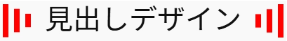
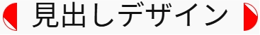
スタイリッシュなアイコン風ー17
詳細を表示
background:
linear-gradient(to left, red 0, red 20%, transparent 20%, transparent 40%, red 40%, red 60%, transparent 60%, transparent 80%, red 80%, red 100%) top / 100% 51% no-repeat,
linear-gradient(to left, gray 0, gray 20%, transparent 20%, transparent 40%, gray 40%, gray 60%, transparent 60%, transparent 80%, gray 80%, gray 100%) bottom / 100% 51% no-repeat;
となっている行の「red」「gray」の部分を書き換えれば他の色にできます。
横の位置がずれる場合は、見出しブロックをグループ化してください。(方法はこちら)
.tantive-heading-stylish40 {
	position: relative;
	width: fit-content;
	padding-right: 0.5em;
	padding-left: 0.5em;
}

.tantive-heading-stylish40::before,
.tantive-heading-stylish40::after {
	content: "";
	position: absolute;
	width: 1em;
	height: 100%;
	top: 50%;
	background:
		linear-gradient(to left, red 0, red 20%, transparent 20%, transparent 40%, red 40%, red 60%, transparent 60%, transparent 80%, red 80%, red 100%) top / 100% 51% no-repeat,
		linear-gradient(to left, gray 0, gray 20%, transparent 20%, transparent 40%, gray 40%, gray 60%, transparent 60%, transparent 80%, gray 80%, gray 100%) bottom / 100% 51% no-repeat;
	clip-path: polygon(0 0, 20% 0, 40% 15%, 60% 15%, 80% 30%, 100% 30%, 100% 70%, 80% 70%, 60% 85%, 40% 85%, 20% 100%, 0 100%);
}

.tantive-heading-stylish40::before {
	left: 0;
	transform: translate(-100%, -50%);
}

.tantive-heading-stylish40::after {
	right: 0;
	transform: translate(100%, -50%) rotate(180deg);;
}
スタイリッシュなアイコン風ー18
詳細を表示
border-left: 4px solid red;
border-bottom: 4px solid red;
background: radial-gradient(circle 3px at center, red 0, red 100%, transparent 100%);
となっている3行の「red」の部分を書き換えれば他の色にできます。
横の位置がずれる場合は、見出しブロックをグループ化してください。(方法はこちら)
.tantive-heading-stylish41 {
	position: relative;
	width: fit-content;
	padding-right: 0.5em;
	padding-left: 0.5em;
}

.tantive-heading-stylish41::before,
.tantive-heading-stylish41::after {
	content: "";
	position: absolute;
	width: 1em;
	height: 1em;
	top: 50%;
	border-left: 4px solid red;
	border-bottom: 4px solid red;
	background: radial-gradient(circle 3px at center, red 0, red 100%, transparent 100%);
	box-sizing: border-box;
}

.tantive-heading-stylish41::before {
	left: 0;
	transform: translate(-50%,-50%) rotate(45deg);
}

.tantive-heading-stylish41::after {
	right: 0;
	transform: translate(50%,-50%) rotate(-135deg);
}
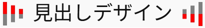
スタイリッシュなアイコン風ー19
詳細を表示
background:
linear-gradient(red, red) center 0% / 5px 5px no-repeat,
linear-gradient(red, red) center 50% / 5px 5px no-repeat,
linear-gradient(red, red) center 100% / 5px 5px no-repeat;
となっている行の「red」の部分を書き換えれば他の色にできます。
横の位置がずれる場合は、見出しブロックをグループ化してください。(方法はこちら)
.tantive-heading-stylish42 {
	position: relative;
	width: fit-content;
	padding-right: 0.5em;
	padding-left: 0.5em;
}

.tantive-heading-stylish42::before,
.tantive-heading-stylish42::after {
	content: "";
	position: absolute;
	width: 5px;
	height: 100%;
	top: 50%;
	background:
		linear-gradient(red, red) center 0% / 5px 5px no-repeat,
    		linear-gradient(red, red) center 50% / 5px 5px no-repeat,
    		linear-gradient(red, red) center 100% / 5px 5px no-repeat;
}

.tantive-heading-stylish42::before {
	left: 0;
	transform: translate(-50%, -50%);
}

.tantive-heading-stylish42::after {
	right: 0;
	transform: translate(50%, -50%);
}
スタイリッシュなアイコン風ー20
詳細を表示
background:
linear-gradient(red, red) center 0% / 5px 5px no-repeat,
radial-gradient(circle 5px at center, red 0, red 100%, transparent 100%),
linear-gradient(red, red) center 100% / 5px 5px no-repeat;
となっている行の「red」の部分を書き換えれば他の色にできます。
横の位置がずれる場合は、見出しブロックをグループ化してください。(方法はこちら)
.tantive-heading-stylish43 {
	position: relative;
	width: fit-content;
	padding-right: 0.5em;
	padding-left: 0.5em;
}

.tantive-heading-stylish43::before,
.tantive-heading-stylish43::after {
	content: "";
	position: absolute;
	width: 10px;
	height: 100%;
	top: 50%;
	background:
		linear-gradient(red, red) center 0% / 5px 5px no-repeat,
   	 	radial-gradient(circle 5px at center, red 0, red 100%, transparent 100%),
    	 	linear-gradient(red, red) center 100% / 5px 5px no-repeat;
}

.tantive-heading-stylish43::before {
	left: 0;
	transform: translate(-50%, -50%);
}

.tantive-heading-stylish43::after {
	right: 0;
	transform: translate(50%, -50%);
}
スタイリッシュなアイコン風ー21
詳細を表示
background:
linear-gradient(gray, gray) right calc(50% – 3px) / 6px 6px no-repeat,
linear-gradient(gray, gray) left calc(50% + 3px) / 6px 6px no-repeat,
linear-gradient(red, red) center 50% / 10px 10px no-repeat;
となっている行の「red」「gray」の部分を書き換えれば他の色にできます。
横の位置がずれる場合は、見出しブロックをグループ化してください。(方法はこちら)
.tantive-heading-stylish44 {
	position: relative;
	width: fit-content;
	padding-right: 0.5em;
	padding-left: 0.5em;
}

.tantive-heading-stylish44::before,
.tantive-heading-stylish44::after {
	content: "";
	position: absolute;
	width: 16px;
	height: 100%;
	top: 50%;
	background:
    	linear-gradient(gray, gray) right calc(50% - 3px) / 6px 6px no-repeat,
    	linear-gradient(gray, gray) left calc(50% + 3px) / 6px 6px no-repeat,
		linear-gradient(red, red) center 50% / 10px 10px no-repeat;
}

.tantive-heading-stylish44::before {
	left: 0;
	transform: translate(-50%, -50%);
}

.tantive-heading-stylish44::after {
	right: 0;
	transform: translate(50%, -50%) scaleX(-1);
}
スタイリッシュなアイコン風ー22
詳細を表示
background: linear-gradient(to bottom right, transparent 0%, transparent 25%, red 25%, red 75%, transparent 75%, transparent 100%);
border: 1px solid red;
となっている2行の「red」の部分を書き換えれば他の色にできます。
横の位置がずれる場合は、見出しブロックをグループ化してください。(方法はこちら)
.tantive-heading-stylish45 {
	position: relative;
	width: fit-content;
	padding-right: 0.5em;
	padding-left: 0.5em;
}

.tantive-heading-stylish45::before,
.tantive-heading-stylish45::after {
	content: "";
	position: absolute;
	width: 1em;
	height: 1em;
	top: 50%;
	background: linear-gradient(to bottom right, transparent 0%, transparent 25%, red 25%, red 75%, transparent 75%, transparent 100%);
	border: 1px solid red;
	border-radius: 0.5em;
	box-sizing: border-box;
	clip-path: polygon(0 0, 100% 0, 100% 50%, 0 50%);
}

.tantive-heading-stylish45::before {
	left: 0;
	transform: translate(-50%, -50%) rotate(-90deg);
}

.tantive-heading-stylish45::after {
	right: 0;
	transform: translate(50%, -50%) rotate(90deg);
}
スタイリッシュなアイコン風ー23
詳細を表示
background:
radial-gradient(circle 3px at 75% 75%, red 0, red 100%, transparent 100%),
radial-gradient(circle 3px at 25% 25%, red 0, red 100%, transparent 100%),
radial-gradient(circle 3px at 25% 75%, red 0, red 100%, transparent 100%),
radial-gradient(circle 3px at 75% 25%, red 0, red 100%, transparent 100%);
となっている行の「red」の部分を書き換えれば他の色にできます。
横の位置がずれる場合は、見出しブロックをグループ化してください。(方法はこちら)
.tantive-heading-stylish46 {
	position: relative;
	width: fit-content;
	padding-right: 0.5em;
	padding-left: 0.5em;
}

.tantive-heading-stylish46::before,
.tantive-heading-stylish46::after {
	content: "";
	position: absolute;
	width: 1em;
	height: 1em;
	top: 50%;
	background:
		radial-gradient(circle 3px at 75% 75%, red 0, red 100%, transparent 100%),
		radial-gradient(circle 3px at 25% 25%, red 0, red 100%, transparent 100%),
		radial-gradient(circle 3px at 25% 75%, red 0, red 100%, transparent 100%),
		radial-gradient(circle 3px at 75% 25%, red 0, red 100%, transparent 100%);
}

.tantive-heading-stylish46::before {
	left: 0;
	transform: translate(-75%, -50%) rotate(45deg);
}

.tantive-heading-stylish46::after {
	right: 0;
	transform: translate(75%, -50%) rotate(45deg);
}
スタイリッシュなアイコン風ー24
詳細を表示
border: 1px solid red;
background:
radial-gradient(circle 5px at 75% 50%, red 0, red 100%, transparent 100%);
background:
radial-gradient(circle 5px at 25% 50%, red 0, red 100%, transparent 100%);
となっている行の「red」の部分を書き換えれば他の色にできます。
横の位置がずれる場合は、見出しブロックをグループ化してください。(方法はこちら)
.tantive-heading-stylish47 {
position: relative;
width: fit-content;
padding-right: 0.5em;
padding-left: 0.5em;
}
.tantive-heading-stylish47::before,
.tantive-heading-stylish47::after {
content: "";
position: absolute;
width: 1em;
height: 1em;
top: 50%;
border: 1px solid red;
border-radius: 50%;
}
.tantive-heading-stylish47::before {
left: 0;
background:
radial-gradient(circle 5px at 75% 50%, red 0, red 100%, transparent 100%);
transform: translate(-75%, -50%);
}
.tantive-heading-stylish47::after {
right: 0;
background:
radial-gradient(circle 5px at 25% 50%, red 0, red 100%, transparent 100%);
transform: translate(75%, -50%);
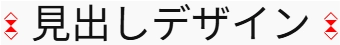
}スタイリッシュなアイコン風ー25
詳細を表示
border: 1px solid red;
background:
radial-gradient(circle 5px at 75% 50%, transparent 0, transparent calc(100% – 1px), red calc(100% – 1px), red 100%, transparent 100%);
となっている行の「red」の部分を書き換えれば他の色にできます。
横の位置がずれる場合は、見出しブロックをグループ化してください。(方法はこちら)
.tantive-heading-stylish48 {
position: relative;
width: fit-content;
padding-right: 0.5em;
padding-left: 0.5em;
}
.tantive-heading-stylish48::before,
.tantive-heading-stylish48::after {
content: "";
position: absolute;
width: 1em;
height: 1em;
top: 50%;
border: 1px solid red;
border-radius: 50%;
background:
radial-gradient(circle 5px at 75% 50%, transparent 0, transparent calc(100% - 1px), red calc(100% - 1px), red 100%, transparent 100%);
}
.tantive-heading-stylish48::before {
left: 0;
transform: translate(-75%, -50%);
}
.tantive-heading-stylish48::after {
right: 0;
transform: translate(75%, -50%) rotate(-180deg);
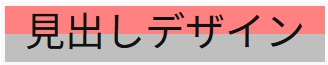
}スタイリッシュな背景ー1
詳細を表示
background-color:red;となっている行の「red」の部分を書き換えれば他の色にできます。
横の位置がずれる場合は、見出しブロックをグループ化してください。(方法はこちら)
.tantive-heading-stylish17 {
	width: fit-content;
	position: relative;
	padding: 0.1em 0.5em;
}

.tantive-heading-stylish17::before {
	content: "";
	position: absolute;
	width: 100%;
	height: 100%;
	left: 0;
	background-color: red;
	opacity: 0.5;
	z-index: -1;
	clip-path: polygon(0 0, 0 100%, 100% 100%);
}
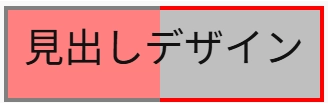
スタイリッシュな背景ー2
詳細を表示
background-color:red;、background-color: gray;となっている行の「red」「gray」の部分を書き換えれば他の色にできます。
横の位置がずれる場合は、見出しブロックをグループ化してください。(方法はこちら)
.tantive-heading-stylish18 {
	width: fit-content;
	position: relative;
	padding: 0.1em 0.5em;
}

.tantive-heading-stylish18::before,
.tantive-heading-stylish18::after {
	content: "";
	position: absolute;
	width: 100%;
	height: 100%;
	top: 0;
	left: 0;
	opacity: 0.5;
	z-index: -1;
}

.tantive-heading-stylish18::before {
	background-color: red;
	clip-path: polygon(0 0, 0 100%, 100% 100%);
}

.tantive-heading-stylish18::after {
	background-color: gray;
	clip-path: polygon(0 0, 100% 100%, 100% 0%);
}
スタイリッシュな背景ー3
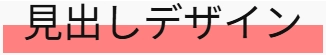
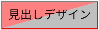
詳細を表示
background: linear-gradient(to bottom, rgb(255,128,128) 0%, rgb(255,128,128) 50%, rgb(191,191,191) 50%, rgb(191,191,191) 100%);となっている行の「rgb()」の部分を書き換えれば他の色にできます。
横の位置がずれる場合は、見出しブロックをグループ化してください。(方法はこちら)
.tantive-heading-stylish19 {
	width: fit-content;
	position: relative;
	padding: 0.1em 0.5em;
	background: linear-gradient(to bottom, rgb(255,128,128) 0%, rgb(255,128,128) 50%, rgb(191,191,191) 50%, rgb(191,191,191) 100%);
}
スタイリッシュな背景ー4
詳細を表示
background: linear-gradient(to bottom, transparent 0%, transparent 50%, rgb(255,128,128) 50%, rgb(255,128,128) 100%);となっている行の「rgb()」の部分を書き換えれば他の色にできます。
横の位置がずれる場合は、見出しブロックをグループ化してください。(方法はこちら)
.tantive-heading-stylish20 {
	width: fit-content;
	position: relative;
	padding: 0.1em 0.5em;
	background: linear-gradient(to bottom, transparent 0%, transparent 50%, rgb(255,128,128) 50%, rgb(255,128,128) 100%);
}
スタイリッシュな背景ー5
詳細を表示
background-color: rgb(255,128,128);、background-color: rgb(191,191,191);となっている行の「rgb()」の部分を書き換えれば他の色にできます。
横の位置がずれる場合は、見出しブロックをグループ化してください。(方法はこちら)
.tantive-heading-stylish27 {
	width: fit-content;
	position: relative;
	padding: 0.5em;
}

.tantive-heading-stylish27::before,
.tantive-heading-stylish27::after {
	content: "";
	position: absolute;
	width: 100%;
	height: 100%;
	top: 0;
	left: 0;
	z-index: -1;
}

.tantive-heading-stylish27::before {
	background-color: rgb(255,128,128);
	clip-path: polygon(0 0, 100% 100%, 0 100%, 100% 0);
}

.tantive-heading-stylish27::after {
	background-color: rgb(191,191,191);
	clip-path: polygon(0 0, 0 100%, 100% 0, 100% 100%);
}
スタイリッシュな背景ー6
詳細を表示
background: linear-gradient(to bottom, transparent 0%, transparent 50%, rgb(255,128,128) 50%, rgb(255,128,128) 100%);となっている行の「rgb()」の部分を書き換えれば他の色にできます。
横の位置がずれる場合は、見出しブロックをグループ化してください。(方法はこちら)
.tantive-heading-stylish21 {
	width: fit-content;
	position: relative;
	padding: 0.1em 0.5em;
}

.tantive-heading-stylish21::before,
.tantive-heading-stylish21::after {
	content: "";
	position: absolute;
	width: 100%;
	height: 100%;
	top: 0;
	left: 0;
	opacity: 0.5;
	z-index: -1;
}

.tantive-heading-stylish21::before {
	background-color: red;
	clip-path: polygon(0 0, 0 70%, 100% 30%, 100% 0);
}

.tantive-heading-stylish21::after {
	background-color: gray;
	clip-path: polygon(0 70%, 0 100%, 100% 100%, 100% 30%);
}
スタイリッシュな背景ー7
詳細を表示
background: linear-gradient(to bottom, transparent 0%, transparent 50%, rgb(255,128,128) 50%, rgb(255,128,128) 100%);となっている行の「rgb()」の部分を書き換えれば他の色にできます。
横の位置がずれる場合は、見出しブロックをグループ化してください。(方法はこちら)
.tantive-heading-stylish21 {
	width: fit-content;
	position: relative;
	padding: 0.1em 0.5em;
}

.tantive-heading-stylish21::before,
.tantive-heading-stylish21::after {
	content: "";
	position: absolute;
	width: 100%;
	height: 100%;
	top: 0;
	left: 0;
	opacity: 0.5;
	z-index: -1;
}

.tantive-heading-stylish21::before {
	background-color: red;
	clip-path: polygon(0 0, 0 70%, 100% 30%, 100% 0);
}

.tantive-heading-stylish21::after {
	background-color: gray;
	clip-path: polygon(0 70%, 0 100%, 100% 100%, 100% 30%);
}
スタイリッシュな枠線ー1
詳細を表示
background: conic-gradient( gray 180deg, red 180deg);となっている行の「gray」「red」の部分を書き換えれば他の色にできます。
横の位置がずれる場合は、見出しブロックをグループ化してください。(方法はこちら)
.tantive-heading-stylish22 {
	width: fit-content;
	position: relative;
	padding: 0.5em;
}

.tantive-heading-stylish22::before{
	content: "";
	position: absolute;
	width: 100%;
	height: 100%;
	top: 50%;
	left: 50%;
	padding: 4px;
	transform: translate(-50%, -50%);
	background: conic-gradient( gray 180deg, red 180deg);
  	-webkit-mask:
    	conic-gradient(black 0deg 360deg),
    	linear-gradient(black, black) content-box;
  	mask:
    	conic-gradient(black 0deg 360deg),
    	linear-gradient(black, black) content-box;
  	-webkit-mask-composite: xor;
  	mask-composite: exclude;
}
スタイリッシュな枠線ー2
詳細を表示
background: conic-gradient( gray 90deg, red 90deg 180deg, gray 180deg 270deg, red 270deg 360deg)となっている行の「gray」「red」の部分を書き換えれば他の色にできます。
横の位置がずれる場合は、見出しブロックをグループ化してください。(方法はこちら)
.tantive-heading-stylish23 {
	width: fit-content;
	position: relative;
	padding: 0.5em;
}

.tantive-heading-stylish23::before{
	content: "";
	position: absolute;
	width: 100%;
	height: 100%;
	top: 50%;
	left: 50%;
	padding: 4px;
	transform: translate(-50%, -50%);
	background: conic-gradient( gray 90deg, red 90deg 180deg, gray 180deg 270deg, red 270deg 360deg);
  	-webkit-mask:
    	conic-gradient(black 0deg 360deg),
    	linear-gradient(black, black) content-box;
  	mask:
    	conic-gradient(black 0deg 360deg),
    	linear-gradient(black, black) content-box;

  	-webkit-mask-composite: xor;
  	mask-composite: exclude;
}
スタイリッシュな枠線ー3
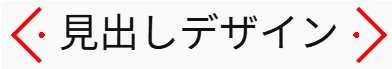
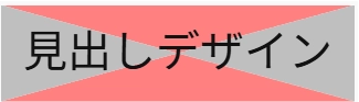
詳細を表示
background: conic-gradient( transparent 90deg, red 90deg 180deg, transparent 180deg 270deg, red 270deg 360deg);、border: 1px solid red;となっている2行の「red」の部分を書き換えれば他の色にできます。
横の位置がずれる場合は、見出しブロックをグループ化してください。(方法はこちら)
.tantive-heading-stylish24 {
	width: fit-content;
	position: relative;
	padding: 0.5em;
}

.tantive-heading-stylish24::before{
	content: "";
	position: absolute;
	width: 100%;
	height: 100%;
	top: 50%;
	left: 50%;
	padding: 4px;
	transform: translate(-50%, -50%);
	background: conic-gradient( transparent 90deg, red 90deg 180deg, transparent 180deg 270deg, red 270deg 360deg);
  	-webkit-mask:
    	    	conic-gradient(black 0deg 360deg),
    	    	linear-gradient(black, black) content-box;
  	mask:
    	    	conic-gradient(black 0deg 360deg),
    	    	linear-gradient(black, black) content-box;
  	-webkit-mask-composite: xor;
  	mask-composite: exclude;
}

.tantive-heading-stylish24::after {
	content: "";
	position: absolute;
	width: calc(100% + 2px);
	height: calc(100% + 2px);
	top: 50%;
	left: 50%;
	border: 1px solid red;
	transform: translate(-50%, -50%);
}
スタイリッシュな枠線ー4
詳細を表示
background: conic-gradient( transparent 90deg, red 90deg 180deg, transparent 180deg 270deg, red 270deg 360deg);、border: 1px solid red;となっている2行の「red」の部分を書き換えれば他の色にできます。
横の位置がずれる場合は、見出しブロックをグループ化してください。(方法はこちら)
.tantive-heading-stylish28 {
	width: fit-content;
	position: relative;
	padding: 0.5em;
}

.tantive-heading-stylish28::before{
	content: "";
	position: absolute;
	width: 100%;
	height: 100%;
	top: 50%;
	left: 50%;
	padding: 4px;
	transform: translate(-50%, -50%);
	background: conic-gradient( transparent 90deg, red 90deg 180deg, transparent 180deg 270deg, red 270deg 360deg);
  	-webkit-mask:
    	conic-gradient(black 0deg 360deg),
    	linear-gradient(black, black) content-box;
  	mask:
    	conic-gradient(black 0deg 360deg),
    	linear-gradient(black, black) content-box;

  	-webkit-mask-composite: xor;
  	mask-composite: exclude;
}

.tantive-heading-stylish28::after {
	content: "";
	position: absolute;
	width: calc(100% + 2px);
	height: calc(100% + 2px);
	top: 50%;
	left: 50%;
	border: 1px solid red;
	transform: translate(-50%, -50%);
	clip-path: polygon(0 0, 75% 0, 75% 25%, 100% 25%, 100% 100%, 25% 100%, 25% 75%, 0 75%);
}
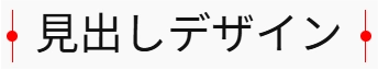
スタイリッシュな枠線ー5
詳細を表示
border-top: 1px solid red;、border-bottom: 1px solid red;、background-color: red;となっている3行の「red」の部分を書き換えれば他の色にできます。
横の位置がずれる場合は、見出しブロックをグループ化してください。(方法はこちら)
.tantive-heading-stylish32 {
	position: relative;
	width: fit-content;
	padding-top: 0.5em;
	padding-bottom: 0.5em;
	border-top: 1px solid red;
	border-bottom: 1px solid red;
}

.tantive-heading-stylish32::before,
.tantive-heading-stylish32::after {
	content: "";
	position: absolute;
	width: 1rem;
	height: 1rem;
	border-radius: 50%;
	background-color: red;
	clip-path: polygon(0 0, 50% 0, 50% 100%, 100% 100%, 100% 50%, 0 50%);
}

.tantive-heading-stylish32::before {
	top: 0;
	left: 1em;
	transform: translate(-50%, -50%) rotate(45deg);
}

.tantive-heading-stylish32::after {
	bottom: 0;
	right: 1em;
	transform: translate(50%, 50%) rotate(45deg);
}
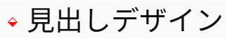
その他ー1
詳細を表示
border-left: 4px solid gray;
border-top: 4px solid gray;
border-bottom: 4px solid gray;
background-color: rgb(255,128,128);
border-right: 4px solid red;
border-top: 4px solid red;
border-bottom: 4px solid red;
background-color: rgb(191,191,191);
となっている各行の「gray」「red」「rgb()」の部分を書き換えれば他の色にできます。
横の位置がずれる場合は、見出しブロックをグループ化してください。(方法はこちら)
.tantive-heading-stylish25 {
	width: fit-content;
	position: relative;
	padding: 0.5em;
}

.tantive-heading-stylish25::before,
.tantive-heading-stylish25::after {
	content: "";
	position: absolute;
	top: 0;
	width: 50%;
	height: 100%;
	z-index: -1;
}

.tantive-heading-stylish25::before {
	left: 0;
	border-left: 4px solid gray;
	border-top: 4px solid gray;
	border-bottom: 4px solid gray;
	background-color: rgb(255,128,128);
}

.tantive-heading-stylish25::after {
	right: 0;
	border-right: 4px solid red;
	border-top: 4px solid red;
	border-bottom: 4px solid red;
	background-color: rgb(191,191,191);
}
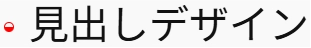
その他ー2
詳細を表示
border-top-color: gray;
border-right-color: red;
border-bottom-color: red;
border-left-color: gray;
background-color: rgb(255,128,128);
background-color: rgb(191,191,191);
となっている各行の「gray」「red」「rgb()」の部分を書き換えれば他の色にできます。
横の位置がずれる場合は、見出しブロックをグループ化してください。(方法はこちら)
.tantive-heading-stylish26 {
	width: fit-content;
	position: relative;
	padding: 0.5em;
	border-width: 4px;
	border-style: solid;
	border-top-color: gray;
	border-right-color: red;
	border-bottom-color: red;
	border-left-color: gray;
}

.tantive-heading-stylish26::before,
.tantive-heading-stylish26::after {
	content: "";
	position: absolute;
	width: 100%;
	height: 100%;
	top: 0;
	left: 0;
	z-index: -1;
	box-sizing: border-box;
}

.tantive-heading-stylish26::before {
	background-color: rgb(255,128,128);
	clip-path: polygon(0 0, 0 100%, 100% 0);
}

.tantive-heading-stylish26::after {
	background-color: rgb(191,191,191);
	clip-path: polygon(0 100%, 100% 100%, 100% 0);
}
その他ー3
詳細を表示
background: linear-gradient(to left, transparent 0, transparent 1em, red 1em, red calc(100% – 1em), transparent calc(100% – 1em), transparent 100%);
border: 1px solid red;
となっている2行の「gray」「red」「rgb()」の部分を書き換えれば他の色にできます。
横の位置がずれる場合は、見出しブロックをグループ化してください。(方法はこちら)
.tantive-heading-stylish38 {
	position: relative;
	width: fit-content;
	padding-top: 0.5em;
	padding-bottom: 0.5em;
}

.tantive-heading-stylish38::before,
.tantive-heading-stylish38:after {
	content: "";
	position: absolute;
	width: 100%;
	height: 10px;
	left: 50%;
	background: linear-gradient(to left, transparent 0, transparent 1em, red 1em, red calc(100% - 1em), transparent calc(100% - 1em), transparent 100%);
	border: 1px solid red;
	border-radius: 5px;
	box-sizing: border-box;
	transform: translateX(-50%);
}

.tantive-heading-stylish38::before {
	bottom: 0;
}

.tantive-heading-stylish38::after {
	top: 0;
}
ブロックをグループ化する方法
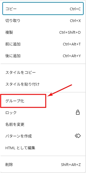
ブロックは以下の手順でグループ化できます。
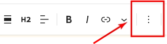
1.ブロックを選択する
2.ブロックツールバーの三本縦点を選択する
3.ポップアップされたメニューの中から「グループ化」を選択する
まとめ
ちょっとしたCSSのコピペだけでも、見出しの印象が大きく変わります。
ぜひあなたのサイトにも取り入れて、見た目にこだわった魅力的なデザインを目指してみてください!
今後も使えるCSSスニペットを追加予定。ブックマーク推奨!